Case 01 — Catawiki
Bringing back the thrill of the auction
Overview
At the end of 2024, Catawiki made a deliberate strategic reset. A prior push into buy-it-now and fixed-price listings hadn't delivered. Those objects sold at a lower rate than auctioned ones in almost every category, and buyers were visiting and bidding less often than before. Research pointed to the reason: when buyers described what they loved about Catawiki, it wasn't just the objects. It was bidding itself, the competition, the suspense, the moment of winning. Catawiki recommitted to the auction as its core experience.

The Object Detail Page, late 2024
That meant investing in three connected levers across the buyer journey:
- Urgency: lifecycle cues that reflected how close an auction actually was to closing, replacing a flat, static countdown.
- Social proof: surfacing real competition, other bidders, other watchers, at the point where a buyer was deciding whether to act.
- Mid-bidding engagement: nudges designed to get a second or third bid, not just a first one, since early drop-off was as much the problem as never bidding at all.
The object detail page was where all three had to converge. It's the surface where a buyer decides whether to trust the object, seller, and platform enough to bid. By 2025 it carried years of usability debt on top of the strategic drift: unclear hierarchy, cluttered information, trust signals that weren't landing.
As Head of Design, I translated the strategy into concrete direction across the buyer journey, secured organizational buy-in, and coordinated the workstreams and designers delivering it.
Role & Approach
My role had two dimensions.
Alignment and discovery
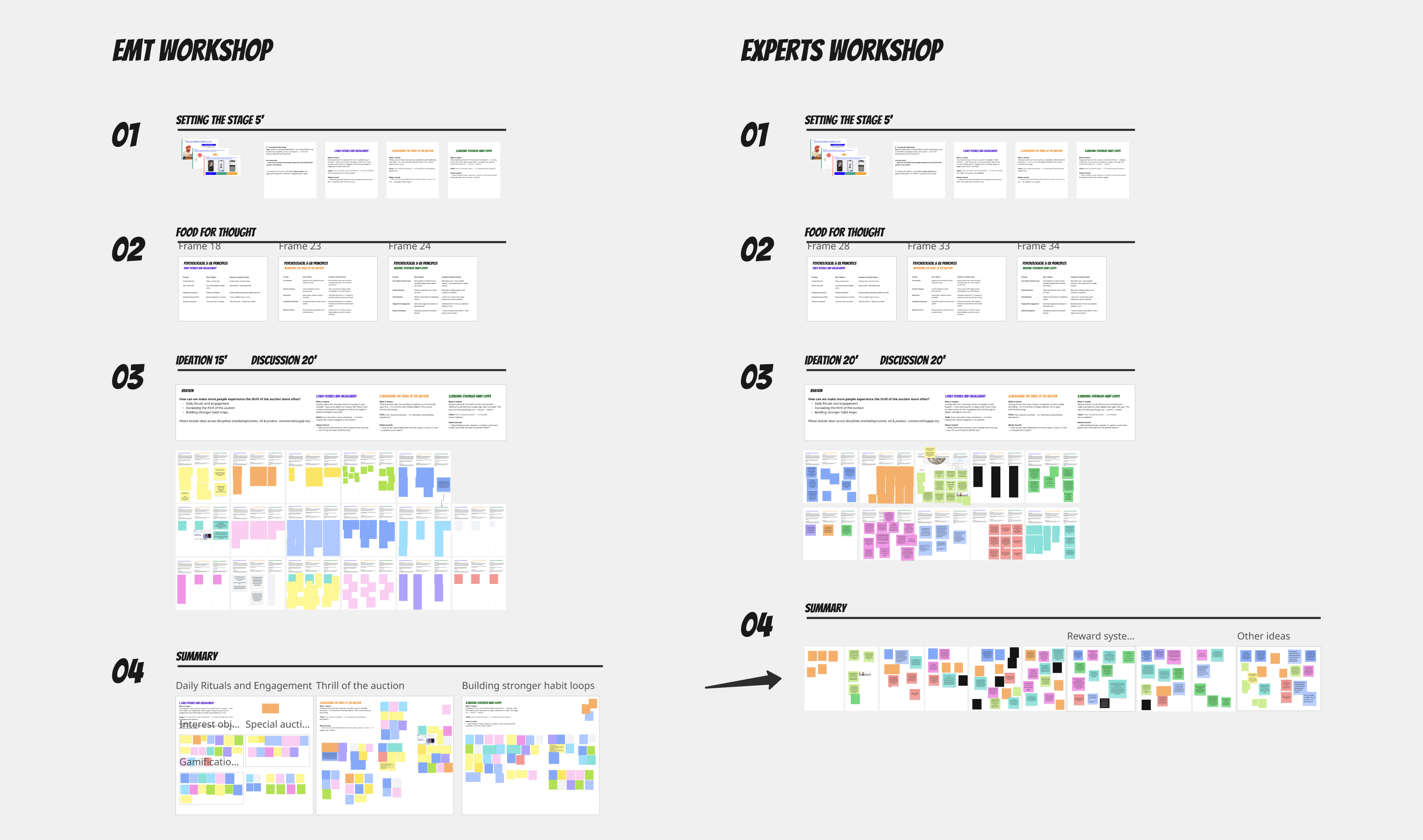
- Executive and commercial alignment: ran discovery workshops with the executive team and 15 experts and category leads from the commercial department, combining their input with voice-of-the-customer research into a single strategic framework the whole program worked from.
- Cross-functional buy-in: got leadership and commercial stakeholders to a shared understanding of what "the thrill of the auction" meant in practice, which made every later conversation about priorities and trade-offs across teams noticeably smoother.
Creative direction and execution
- Mobile-first strategy: directed a north star vision focused on mobile, since 70-75% of bidding happened there, while shaping tailored additions for web and the app, like live auction updates.
- Hands-on co-creation: ran design jams with PMs and designers to slice that vision into testable, iterable releases. Going beyond facilitating, I proposed ideas and stepped into the design work myself when it was needed.
- Rigorous validation: combined unmoderated Maze testing with live A/B experiments on high-friction surfaces like the timer and bidding panel, since not every idea that looked good on paper held up with real bidders.
Success was measured primarily by winning and bidding rate, with bids per user and return rate as the next layer of signal.
Key Decisions
Buyer priorities were explicit: better auction discovery, more desirable objects, the thrill of the auction itself, and reasons to come back. Mobile was the bar every decision had to clear, since 70-75% of users bid there, even when a design that worked on desktop didn't hold up on mobile, or the reverse.
The bidding section of the page, price, timer, bid history, button, was where things worked against themselves the most. The timer looked the same whether an auction closed in five days or five minutes. Pricing was scattered. Bidders in the bid history read like placeholder data.
Here's how each of those got solved.
1. Making the timer reflect the auction.
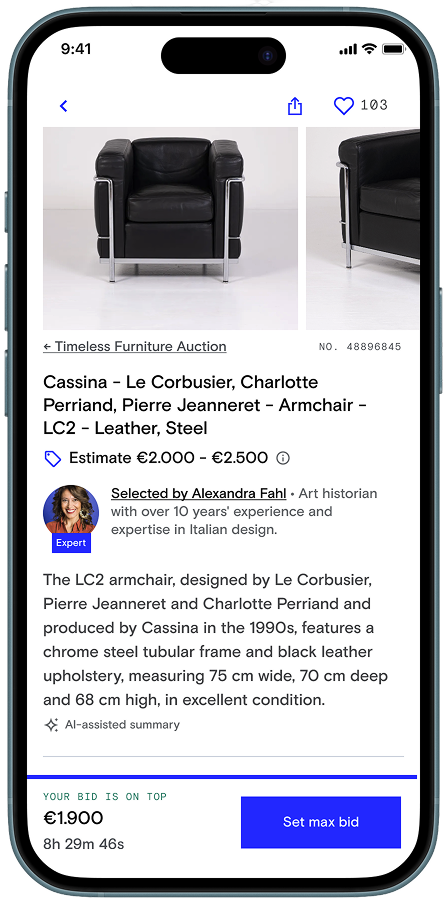
The timer read "Closes in 4h 39m 43s," styled identically no matter how much time was left. It gave buyers no reason to feel urgency, and no reason to come back once they'd moved on.
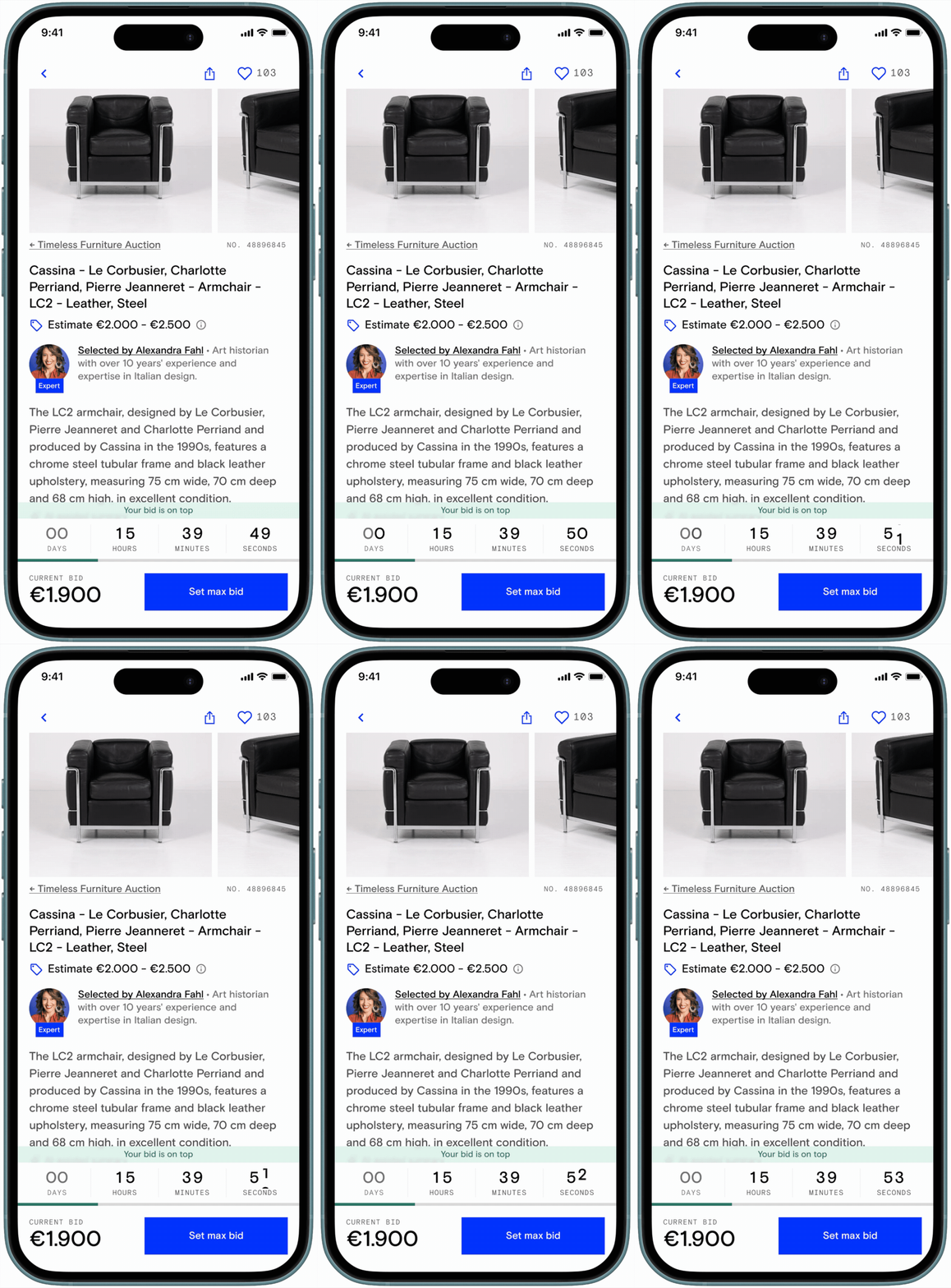
The fix made the timer's appearance track the auction's actual state. It grew larger and more insistent as the close approached. Colour and animation shifted in the final hour. Outbid signals made a lost lead as visible as the time running out. The same escalation logic carried through to a lock screen live activity, so the countdown stayed visible even after someone closed the app, most critically in the final four hours before close.
Before
After
Result: the timer became one of the clearest urgency signals in the redesigned experience.
2. Trusting the data over the instinct.
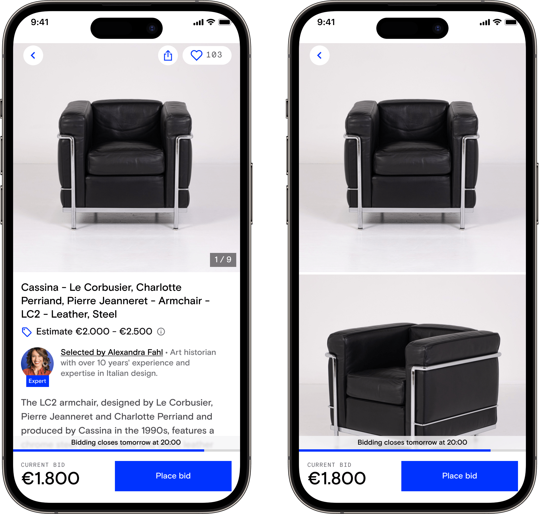
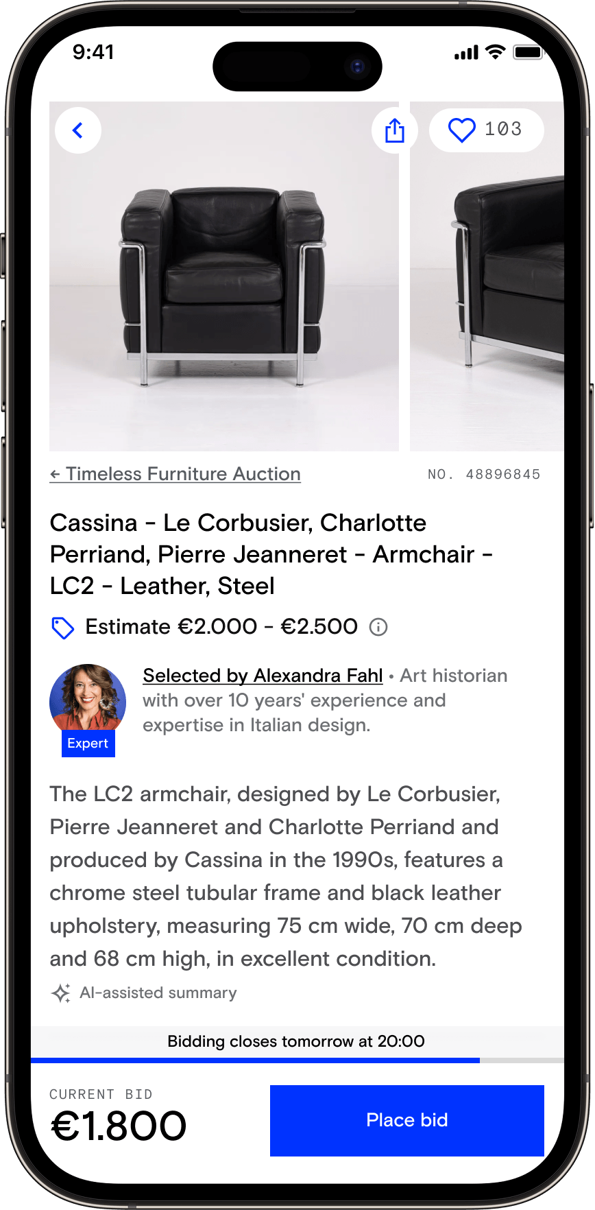
Bigger, more immersive photos seemed like an obvious confidence builder. We redesigned the gallery: larger images, thumb-swipe, a progress bar. On desktop it worked as expected. On mobile it didn't. The number of bidders and bids per user both dropped, across iOS and Android, even though people engaged with the new gallery more and scrolled further into it than before.
The instinct wasn't wrong, exactly. It just wasn't converting into more bidding, and while gallery engagement rose, we couldn't fully explain why bidding fell. Rather than over-invest in diagnosing the gap, we deprioritised the redesign and flagged it for a later return.
Vision for the gallery
Reverted gallery
Result: first version reverted on mobile. A clear example of testing catching what instinct alone wouldn't have.
3. Toning down social proof to make it credible.
Bid activity, how many people were bidding, how many were watching, needed to move from lower on the page, where it read as background information, up next to the buttons, where a buyer was actually deciding whether to act. But moving it wasn't what made it work.
The first version pushed hard: bold red copy on a coloured background, constant and insistent. It read as aggressive rather than exciting, and bidding dropped. The fix scaled it back to a plain count of active bids and followers, with the full bid history expanding only when someone tapped to place a bid. Less visual pressure, not more, is what made buyers trust the signal.
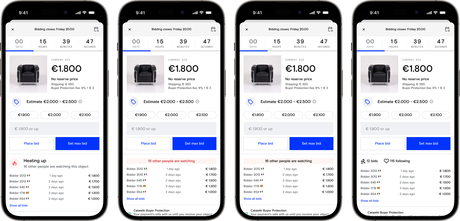
Result: GMV won per participant on web rose over 6%. The louder version had the opposite of its intended effect; the quieter one delivered it.
4. Holding the quality bar on AI-generated content.
Two new pieces of the page ran on AI-generated content: a one-sentence object summary, and a generated expert bio meant to reinforce trust in the object's selection.
The summary worked from the start. Bidders rose over 1.6%, and a later iteration on the model and prompts pushed it further still.
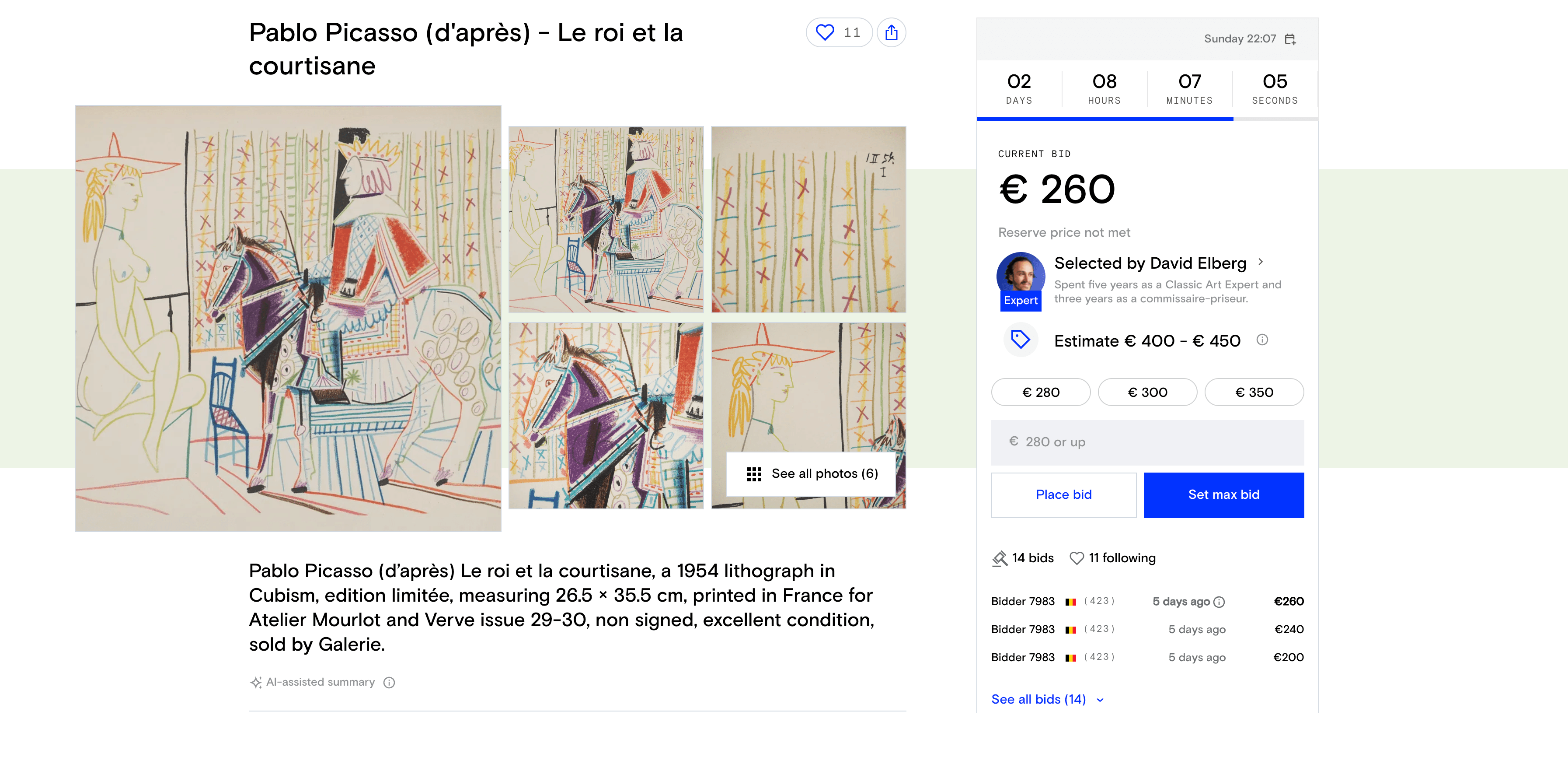
The expert bio didn't. Digging into why revealed the generated content itself was subpar. It went through prompt improvements and changes to the underlying content logic, then relaunched successfully.

Result: one AI feature succeeded immediately, the other needed a diagnose-and-fix cycle before it did. Both shipped working.
A larger set of changes shipped alongside these four: trust signals like free shipping and no-reserve-price labels, a redesigned seller block, human seller names replacing anonymized ones, quick bid buttons, outbid notifications and CRM improvements, and a "Stay in the Game" section on Home.
Outcome & Impact
What shipped
- Bidding and winning rate: consistent improvements across most experiments, including a 4% increase in GMV won and a +2% increase in winners.
- Timer: a dynamic countdown, on-page and as a lock screen live activity, replaced a static one and became one of the clearest urgency signals in the redesigned experience.
- Social proof: increased GMV won per participant by over 6%, after the pushy first version was stopped, diagnosed, and relaunched in a quieter form.
- AI object summaries: improved bidder rates by 2% from launch, and further after a later content iteration.
- AI expert bios: underperformed initially due to content quality, then improved bidding confidence after prompt and logic fixes.
- Seller names: 61,000 anonymised names replaced with human-readable ones, contributing to higher bid values and improved payment completion.
Leadership impact
- Shared language: the discovery workshops before design began created a common vocabulary that held across a long, multi-team initiative.
- Discipline to stop and fix: pulling back on the gallery redesign and the first social proof version, rather than pushing them through, meant what shipped was meaningfully better than what it replaced.
- Single point of accountability: directed design across the ODP and adjacent surfaces, like notifications and live activities, rather than each shipping in isolation.
Reflection
The discovery workshops proved something at a scale I hadn't seen before: shared language is foundational work. Getting agreement on what "the thrill of the auction" actually meant made every later conversation about roadmap and trade-offs smoother, well beyond product and design.
Designing with AI-generated content taught me something more specific. You can't fully judge it before it ships. What a model produces at scale, across thousands of different objects, isn't fully predictable in advance. Testing, catching quality issues early, and being willing to revise after launch has to be part of the process from the start, not a sign that something went wrong.
If I did this again, I'd isolate one variable per test. The gallery redesign bundled a larger gallery, a smaller title, and new button placement into a single test. That made it harder, and slower, to tell which change was actually hurting bidding on mobile. A narrower test first, then added complexity once I knew what was doing the work, would have gotten a clearer answer faster.