I'm a design leader with almost twenty years of experience in digital products. As Head of Product Design at Catawiki, I oversee UX and content design across the organisation and partner with senior leadership to improve marketplace experiences. My focus is on clear strategy, strong collaboration, and practical execution that drive measurable impact.
My experience spans Booking.com, GameHouse, TravelBird and Tiqets, where I've worked across mobile, web, marketplace flows, subscription products and partner tooling. Over the past decade, my leadership roles have focused on strengthening design culture, introducing design foundations and competency frameworks, and hiring and mentoring designers as teams grew. My earlier background in computer science continues to ground my approach in structured problem solving and systems thinking.
Outside work, I'm a mum of two and the human of a very opinionated cat. I'm a coffee enthusiast, regular at CrossFit, reader and watcher of sci-fi and historical fiction, and an adventurous traveller whenever life allows.
To read more about my experience, you can have a look at my CV below. View my CVAt the end of 2024, Catawiki made a deliberate strategic reset. A prior push into buy-it-now and fixed-price listings hadn't delivered the trade-off it promised: those objects sold at a lower rate than auctioned ones in almost every category, and existing buyers were visiting and bidding less often than before. User research pointed to the reason: when buyers described what they actually loved about Catawiki, the answer wasn't the objects for sale, it was the act of bidding itself: the competition, the suspense, the moment of winning. So Catawiki recommitted to the auction as its core experience, the format its own buyers had told it they wanted.
Bringing that energy back meant investing in three connected levers: a stronger sense of urgency throughout the auction lifecycle, credible social proof and competition, and nudges that kept buyers engaged mid-bidding rather than losing them after a single bid. Placing a second or third bid mattered just as much as placing the first one.
The object detail page was where most of this had to converge. It's the surface where a buyer decides whether to trust the object, the seller, and the platform enough to bid, and by 2025 it had accumulated years of usability debt on top of the strategic drift: unclear hierarchy, cluttered information, trust signals that weren't landing. Redesigning it wasn't a separate initiative from the thrill-of-the-auction strategy, it was the infrastructure that made the strategy liveable. Timers, urgency cues, and social proof needed a page built to hold them with intention, or they would have piled onto an already disorganised surface and diminished each other's impact.
As Head of Design, I translated the strategic shift into concrete design direction across every surface throughout the buyer's journey, secured organizational buy-in, and coordinated the workstreams and designers responsible for each from discovery through to delivery.
My role had two dimensions that ran simultaneously throughout the initiative. The first was organisational: before any design work began, I ran discovery workshops with the executive team and with 15 experts and category leads from the commercial department, compiling their insights into the strategic foundation the whole program worked from. I paired this with the voice of the customer, drawing on what buyers were already telling us about what made bidding worth coming back for. Getting leadership and commercial stakeholders to a shared understanding of what "the thrill of the auction" actually meant in practice made every subsequent conversation about priorities and trade-offs across every surface significantly smoother.
The second dimension was creative direction across the surfaces the strategy touched: the object detail page, category and auction pages, and the bidding process itself, including notifications. Nearly all of this was approached mobile-first, since that's where the majority of bidding activity happened, with the app carrying its own specific additions on top, like live auction updates. I ran design jams to establish a north star vision, then worked with the PMs and director of product to slice that vision into testable, iterable releases across the teams responsible for each surface.
My day-to-day involvement was hands-on. Inside the design jams I wasn't just facilitating, I was proposing ideas and working through solutions directly alongside the designers and PMs, and I stepped into the design work myself when it was needed. We validated our thinking with unmoderated user tests via Maze and rigorous A/B testing, since not every idea that looked promising on paper held up once it was in front of real bidders.
Success was measured primarily by winning and bidding rate, with bids per user and return rate as the next layer of signal.
These decisions weren't arbitrary starting points. The buyer priorities behind the strategy were explicit: existing buyers wanted better auction discovery and more desirable objects, they wanted the thrill of the auction itself, urgency, social proof, competition, and they wanted reasons to keep coming back. Each decision below sits inside one of those buckets.
Mobile mattered throughout, though not in the same way for every decision. Each surface was designed and tested on its own platform, and a version performing well on desktop didn't always hold up on mobile, or the reverse. But since 70-75% of users bid on mobile, mobile performance was the bar any design ultimately had to clear, whatever happened elsewhere.
Once the priorities were set, turning them into an actual page meant taking the ODP apart piece by piece and checking each part against what a buyer needed to feel or do at that exact moment: understand the auction, want the object, feel ready to act, or want to keep looking. The section where a buyer actually decided whether to bid, the price, the timer, the bid history, the button itself, was where the existing page worked against itself the most: the timer looked identical whether an auction closed in five days or five seconds, pricing information was scattered across the panel instead of sitting together, and the bidders listed in the bid history read more like placeholder data than real people.
What follows is how each of those specific problems got solved.
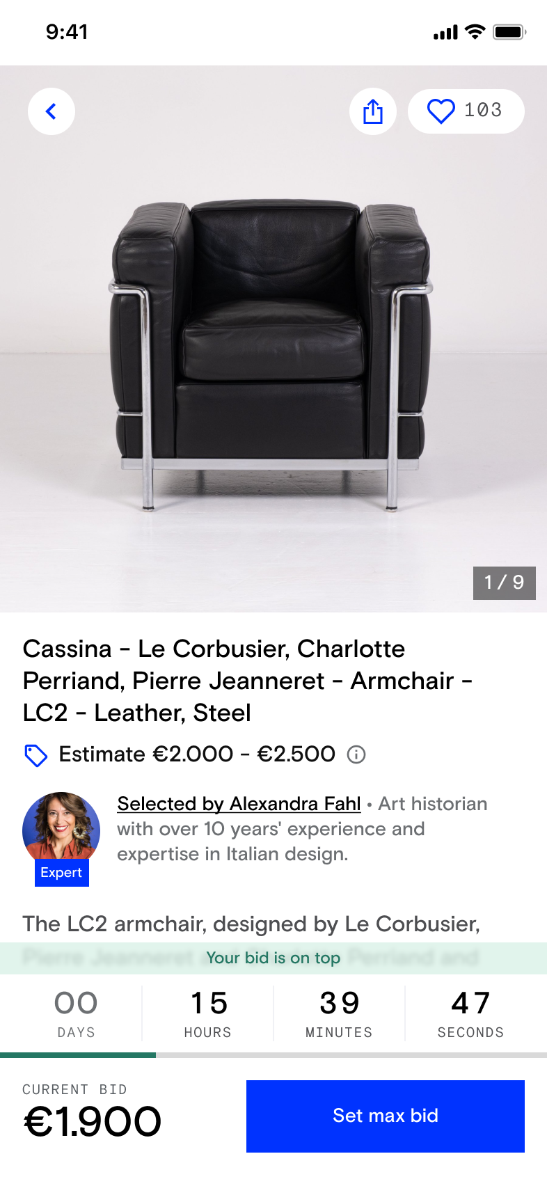
The existing timer was flat: "Closes in 4h 39m 43s," styled identically whether a lot had days left or was about to close. It gave buyers no reason to feel the moment mattered, and it meant an early bidder who'd moved on had nothing pulling them back when it counted. The fix made the timer's appearance track the actual state of the auction: it grew larger and more insistent as the close approached, colour and animation shifting in the final hour, an "Ending today" treatment replacing the static label, paired with outbid signals so a lost lead was as visible as the time running out.
Before
After
The same treatment extended past the page itself. A live activity on the lock screen and home screen showed the same information, time remaining and the buyer's current bid, animated the same way, so the countdown didn't stop mattering just because someone closed the app. It mattered most in the final four hours before a lot closed, the exact window the on-page timer was already built to escalate around.
The intuitive bet was that bigger, more immersive photos would build more confidence to bid: the image gallery got a full redesign, larger pictures, thumb-swipe, a progress bar. On desktop, it worked as expected and shipped with no downside. On mobile it consistently hurt the metrics that mattered, serious bidders down, bids per user down, across iOS and Android, even though people engaged with the new gallery more, scrolling further into it than before. The instinct that buyers wanted bigger images wasn't wrong, it just wasn't converting into more bidding.
The first iteration failed: bidding activity dropped on mobile, even as gallery engagement itself went up. Rather than over-invest in diagnosing the gap between the two, we deprioritized it, focused on higher-impact problems, and flagged it for a later return.
Vision for the gallery
Reverted gallery
Alongside the timer, this was the other core piece of bringing the thrill of the auction back: buyers weren't just choosing an object, they were racing other people for it. But that only worked if the competition showed up in the right place on the page. Bid activity, how many people were bidding, how many were watching, originally sat lower down, treated as background information alongside the object description and seller details. It didn't belong there, it was information about the competition, not the object, and it needed to live where the buttons were, the part of the page focused on justifying and acting on a bid.
The first version overcorrected: bold red copy on a coloured background, pushing the sense of competition hard and constantly. It read as aggressive rather than exciting, and bidding dropped. The fix toned it down considerably: a plain count of active bids and how many people were following the object, with the full bid history only expanding when someone tapped to place a bid on mobile, the exact moment competition actually mattered to them. This version worked, GMV won per participant on web rose over 6%, without the pushiness that had worked against the first attempt.
Two new pieces of the page ran on AI-generated content: a one-sentence object summary meant to help buyers grasp what made something worth bidding on without reading a full seller description, and a generated expert bio meant to reinforce trust in the object's selection.
The summary worked from the start, bidders rose by over 1.6%, and a later iteration on the model and prompts pushed it further still.
The expert bio didn't. Digging into why revealed the generated content itself was subpar. It went through prompt improvements and changes to the underlying content logic, then relaunched successfully.
Generating content with AI isn't something you can fully judge before it ships. What the model actually produces at scale, across thousands of different objects, isn't fully predictable in advance. Stopping to reassess, adjusting the model and the logic behind it, and being willing to revise after launch mattered as much as the original decision to build it.
These four decisions are representative, not exhaustive. Alongside them, a much larger set of changes shipped across the ODP and beyond: trust signals like free shipping and no-reserve-price labels, a redesigned seller block and page, human seller names replacing anonymized ones, quick bid buttons at the point of confirmation, outbid notifications and CRM improvements, and a "Stay in the Game" section on Home surfacing time-sensitive auctions buyers were already engaged with.
This project reinforced something I already believed but hadn't seen proven at this scale: that alignment on shared language is foundational work. The workshops I led before any design work began did more than inform the direction. They created a common vocabulary around what "the thrill of the auction" actually meant, and that made every subsequent conversation about roadmap, priorities, and trade-offs significantly smoother, well beyond the product and design teams.
It also taught me something more specific about designing with AI-generated content: it's not something you can fully judge before it ships. What a model actually produces at scale, across thousands of different objects, isn't fully predictable in advance, so testing, catching quality issues early, and being willing to revise after launch has to be part of the process from the start, not a sign that something went wrong.
If I did this again, I'd push harder for isolating one variable at a time before testing. The gallery redesign bundled a larger image gallery, a smaller title, and new button placement into a single test, which made it harder to tell which specific change was hurting bidding on mobile, and slower to get a clear answer. I'd rather ship a narrower test first and add complexity once I knew which single change was actually doing the work.
By early 2025, Catawiki had a visible customer satisfaction problem. Buyers and sellers were publicly expressing frustration on Trustpilot: slow responses, unresolved cases, feeling abandoned by a platform they'd trusted. Support hadn't scaled with the business, and retention was suffering for it. The solution Catawiki needed wasn't just more agents; it was a fundamentally different approach to first-contact support.
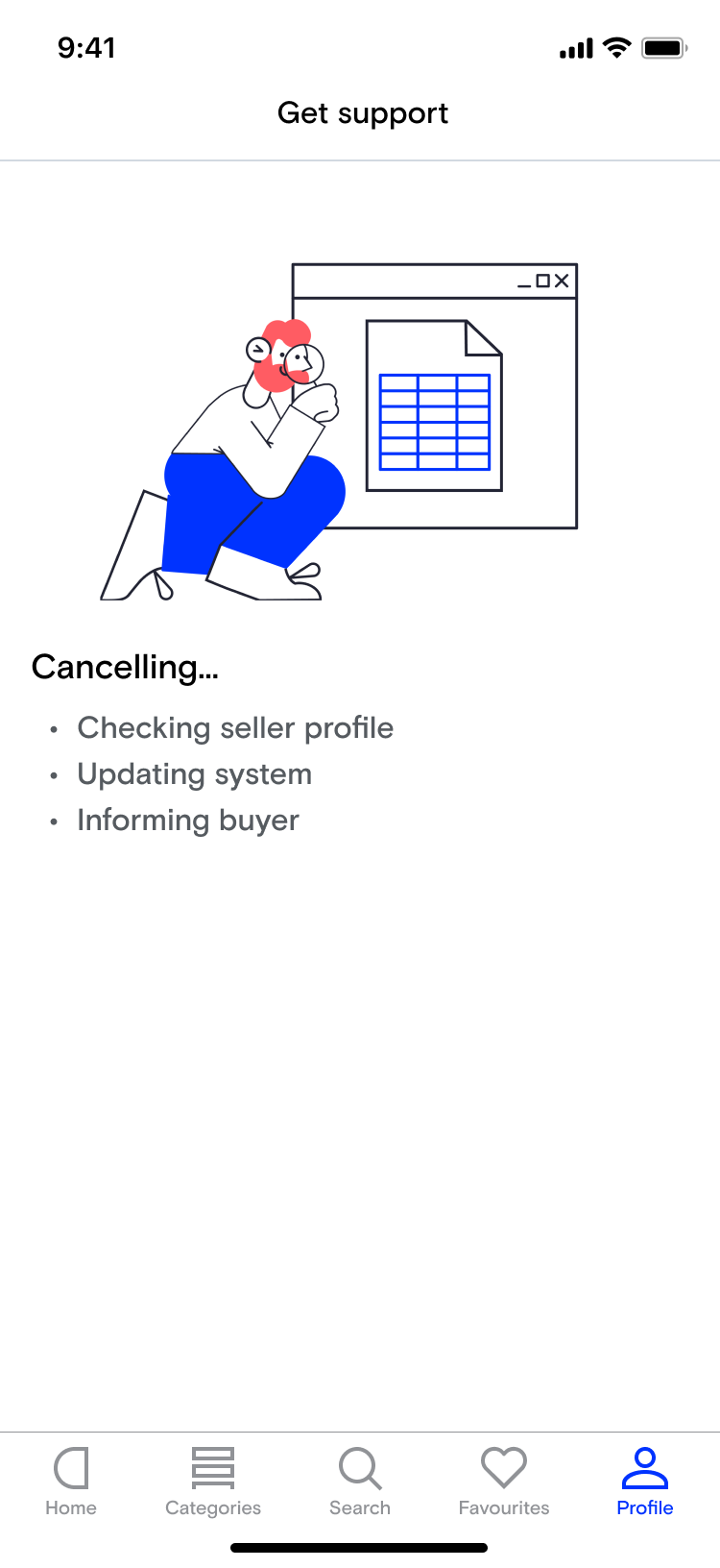
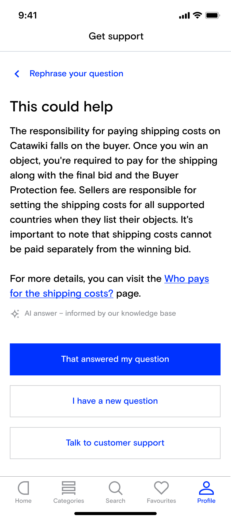
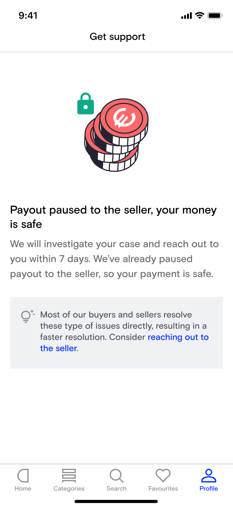
The answer was Catawiki's first production AI experience: an AI assistant as the first point of contact for all support queries, for both buyers and sellers. It was delivered in two phases. Phase one answered general questions using help centre knowledge. Phase two connected the AI to live systems to handle transactional queries and trigger actions like cancellations and refunds, covering roughly 70% of all incoming contacts. The project was one of Catawiki's highest priorities for 2025 and remains ongoing.
I led this project as Head of Design, coordinating a team of three designers across content, interaction, and design systems, and representing design at the leadership table alongside CS, product, engineering, data science, policy, and trust and safety.
My role had three dimensions: helping the team shape a north star vision for what great AI-powered support could look like, being a thought partner on key design decisions, and representing design at a leadership table where CS, product, engineering, data science, policy, and trust and safety all had a seat. This wasn't a design-led project in the traditional sense: engineering and data science carried a lot of the weight. My job was to make sure the user stayed at the centre of decisions that could easily have been made on purely technical or operational logic.
A key part of my contribution was establishing a way of working for AI design inside Catawiki: defining guardrails, building evaluation processes, and creating the principle that this kind of product requires continuous iteration rather than a launch-and-move-on mindset. I introduced the wave pool model to reframe what design means in AI-driven experiences: not fixed flows, but designing for unpredictable, nonlinear conversations where every user takes a different path.
The audit and rewrite of all help centre content required buy-in across product and commercial teams, and in practice meant auditing, correcting, merging, and deleting articles: unglamorous work that is easy to deprioritize. The decision to do it properly before building, rather than shortcutting it, was one of the most consequential calls on the project.
When a model update started adding headers to responses and broke the tone of voice completely, having standardized response templates meant we could catch and correct it quickly rather than letting the design quietly unravel. The real value of standardization wasn't uniformity for its own sake: it was reducing our dependence on the behaviour of the underlying model.
The two-phase structure was driven by technical dependencies, not user needs. During the period when both flows coexisted, the design challenge was ensuring the transition felt seamless. Users shouldn't have to understand the infrastructure to get help.
With a fixed product, you test the happy flow and ship. With AI, the model's behaviour shifts with updates, and conversations go in directions you never anticipated. The decision to build prompt refinement and sentiment monitoring into the team's regular rhythm, permanently, was a cultural shift as much as a process one.
A full launch would have scaled problems before we could identify them. Incremental exposure gave us room to observe, learn, and adjust at each stage before going further.
This project changed how I think about what design leadership means in an AI context. On most projects, the design team's job is to define the experience and then hand it over. Here, shipping was the beginning of the work, not the end.
What I'm most proud of is establishing a way of working that the organisation could carry forward. The structured experimentation, the prompt refinement cycles, the content standardisation approach: these weren't just solutions to this project's problems, they became patterns for how Catawiki thinks about AI product work more broadly.
The thing I'd do differently is push for design to be involved earlier in the technical scoping. There were moments where architectural decisions had already been made that constrained the experience in ways that were hard to unpick later.
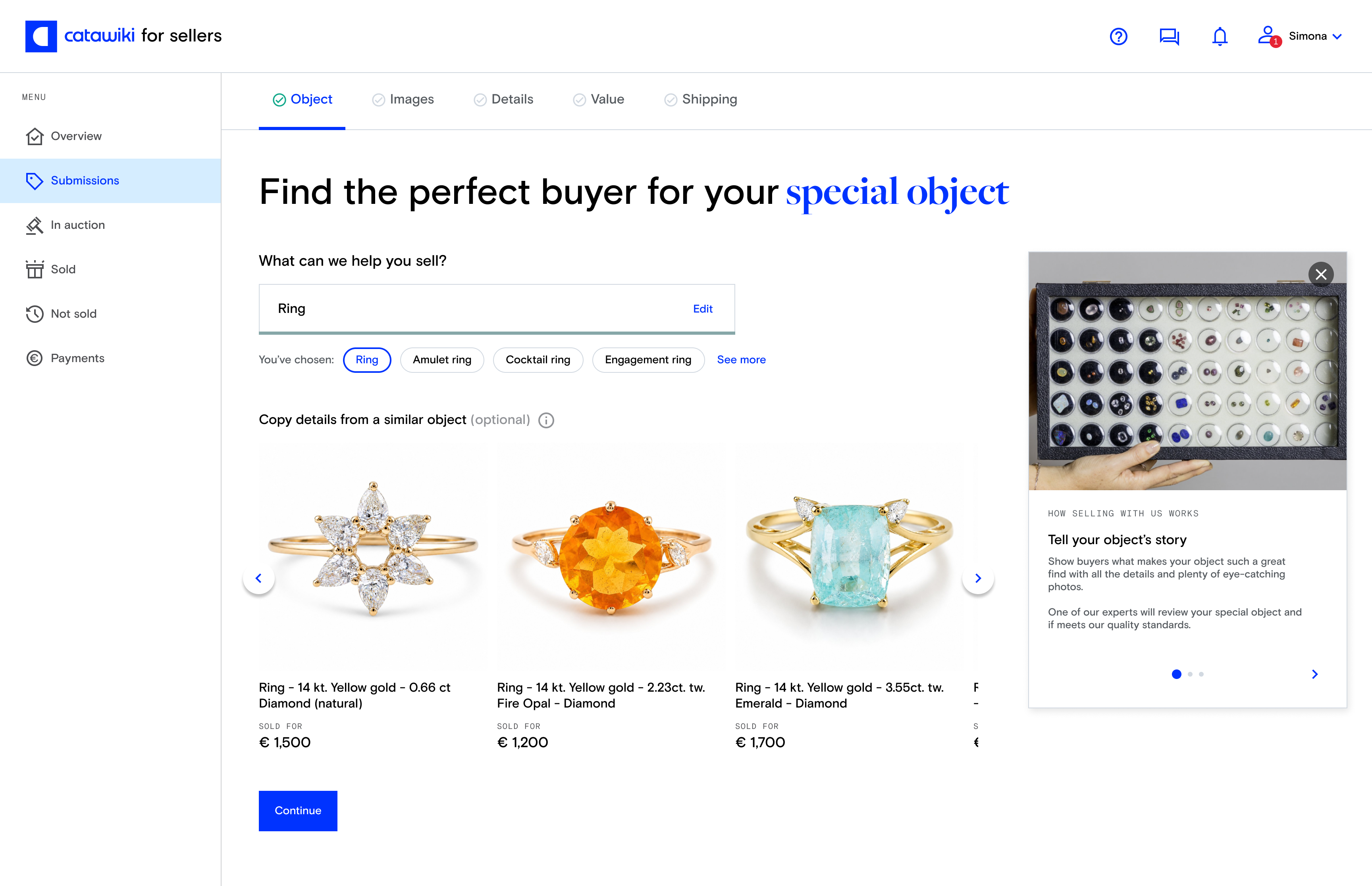
Catawiki's original submission flow asked sellers to choose an auction before describing their object. Which auction is right for my diamond ring? Most sellers didn't know, and neither did the flow. When experts corrected the auction choice after the fact, all the structured data the seller had submitted was lost, tied to the auction rather than the object, requiring manual rework. The questions sellers were asked were generic rather than specific to what they actually had to sell, which limited data quality on both sides of the marketplace.
OBS flipped the model entirely: start with the object, not the auction. "What do you have to sell?" became the opening question, followed by cascading, object-specific questions that built structured data tied to the object itself. The result was richer, more accurate data collection, a faster and clearer seller experience, and significantly improved search, filters, and recommendations for buyers. It also unlocked auction flexibility and multi-auction listing that the old architecture couldn't support.
I joined this project in May 2021 as an individual contributor, defined the seller-facing UX from scratch, and grew into a design manager role in November 2022, leading three multidisciplinary product teams through to full launch in 2024. It remains the most structurally significant project I've worked on at Catawiki.
I joined Catawiki in May 2021 as the designer responsible for defining the seller-facing UX of OBS from scratch. The infrastructure shift was already underway, but there was no design vision for what sellers would actually experience. I ran a design sprint in August 2021 with one other product designer, the UX writer, and the design systems designer to establish that vision, then spent the following year refining it, validating it through multiple rounds of moderated user testing with real sellers, and aligning it with stakeholders and senior leadership.
The central design challenge during this phase was that OBS needed to serve two fundamentally different user groups simultaneously. First-time sellers needed guidance and an educational experience. Business and pro sellers, who were roughly 3-4% of the seller base but drove around 45% of submissions, needed efficiency and speed. I built two prototypes for the same underlying flow, one per user group, to test how the same system could serve both.
In November 2022 I became Group Design Manager, continuing to lead OBS while coordinating three multidisciplinary product teams within the Supply vertical. I directly managed three product designers and coordinated the work of a design systems designer and a UX writer. My role shifted from doing the design to being the connective tissue: running weekly alignment meetings, design critiques, and design jams to maintain consistency across teams in design language, tone of voice, and overall UX.
Pro sellers were a tiny fraction of the seller base but drove nearly half of all submissions. Rather than building separate experiences, I designed a single submission UI that adapted to returning sellers: prefilling preferences, remembering previous inputs, reducing repetition. The same journey served beginners and experts at different stages of the same path.
The old model asked sellers to choose an auction first. The new model started with the object. Rather than a hard cutover, I designed both paths to coexist: backwards-compatible with existing seller behaviour, forwards-compatible with the new infrastructure. Pro sellers were few but vocal, and a forced switch would have caused significant disruption to a disproportionately valuable part of the business.
Before OBS, design decisions were based on submission rate and sell rate, which tended to stay flat during transitions and gave us little signal. I introduced Customer Effort Score, running a survey widget inside each variant of every A/B test. After roughly 1,500 responses per variant, results were segmented by new versus existing sellers and pro versus private sellers, giving us clear visibility into who was being affected and how.
The entire platform infrastructure was changing underneath the experience. Releasing in small, controlled increments meant any issue could be isolated and reversed without affecting the whole system. This discipline proved its value when pro seller pushback forced us to pause, reassess, and fix before continuing.
When the first major infrastructure release went live, a small number of pro sellers in specific categories were unhappy enough to threaten leaving. The core problem turned out to be auto-generated titles: a lamp in a Lighting auction was simply called "lamp." We paused further releases, brought in a taxonomist, audited title templates across the most affected object types, rewrote question sets, and added a live object card preview to the submission flow so sellers could see in real time how their answers were building the title. This is where pro seller CES doubled from 25% to 50%.
The old flow had four visible steps and two hidden ones. Sellers skipped steps, got confused, and came back to fill in earlier fields. Rather than bundling a UI overhaul with the infrastructure changes, I tested moving to a single long-form page with in-page navigation as an isolated experiment. CES improved, submission rate and sell rate held steady, and it gave us the confidence to proceed with the deeper structural changes.
What I'm most proud of is the scale of what this flow serves: around 200,000 sellers across vastly different levels of tech-savviness and an enormous diversity of object types. Whether you're submitting a car, a Rolex, a limited-edition Lego set, or a designer armchair, the experience is the same. What changes is the questions we ask and the photos we request, not the UI itself. Getting that balance right across three years and a complete infrastructure overhaul is the thing I'd point to first.
Two things I'd do differently: involve internal experts much earlier, and push for working prototypes sooner across the board. Experts struggled to engage with static mockups, but the moment we put working prototypes in front of them the feedback was immediate and rich.
When I joined Catawiki's design team, the competency framework wasn't working. It didn't reflect how the team had matured, wasn't useful for hiring or promotions, and created constant misalignment between managers and designers. People didn't know what good looked like at each level, and growth conversations felt arbitrary as a result.
The problems this caused were concrete: performance ambiguity, career frustration, and inefficient hiring. I led the complete redesign of the framework in early 2025, creating a unified structure covering product designers, design systems designers, and content designers, built around five core competencies and five proficiency levels.
I owned this end-to-end, from gap analysis and framework design through to stakeholder alignment and team rollout.
I worked with HR partners, hiring managers, and senior individual contributors across the design team to make sure the framework worked for everyone it would affect. My process started with understanding where things weren't working: conversations with designers and managers surfaced where the existing framework was causing ambiguity or frustration. I then benchmarked against industry standards and Catawiki's engineering competency framework, which gave me both a quality bar and a structural reference point for consistency across the company.
From there I defined five core competencies with clear proficiency levels, created discipline-specific descriptions where the expectations for designers and writers genuinely diverged, and aligned the whole thing with HR's company-wide competency structure. I validated with individual contributors and managers before finalizing, then rolled it out with team presentations.
Each competency could have had ten subcategories, but that would have killed the usefulness. I landed on five competencies that covered what mattered: Design Vision, Business Acumen, Craft Execution, Stakeholder Management, and Leadership. A framework's value is in clarity, not in covering every edge case.
The biggest shift was moving from "what you do" to "how well you do it." Instead of vague checkboxes, each level describes the expected degree of mastery. This gives people a clear target and makes growth conversations more concrete and useful.
Writers and designers needed different frameworks, but I kept the structure consistent across both: the same five competencies, the same proficiency model. This created alignment while respecting that craft execution looks different for a writer than a designer.
Rather than creating a separate track, I added targeted notes under each competency explaining how expectations shifted for that role. It kept things simple while acknowledging their unique scope within the team.
The hardest part of this project was resisting the urge to make it comprehensive. Every time I added a nuance, I was making it less useful. The discipline of simplicity, choosing clarity over coverage, is something I'd apply more consciously from the start on any future framework work.